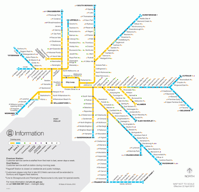
In 2017 PTV launched their new network map, which contained all their heavy rail services on the one map for the first time. The previous map hadn't shown V/Line services - it only showed Metro services, and it prioritised showing which ticketing Zone each station was in. Since Zone 2 has (sort of) been eliminated now, this was less important to show - so instead they've colour-coded it to show the different groupings of lines. This same colour-coding is now being applied to information screens at stations, and so on - which is definitely a good thing.
 |
| The old map, which emphasised ticketing zones (via PTV) |
There's a lot to like about the new network map, but my biggest gripe with it is how un-geographical it is. It has the City Loop at the centre, but most of the Metro lines only head in the rough general direction they do in real life - and the V/Line lines are all over the shop, bent back on themselves to fit around the margins of the Metro network, and bearing no resemblance to what they do in real life.
A good rail network map shouldn't usually be 100% true to the geography of the place it's representing, because that would usually mean a tangled incomprehensible mess where the network is densest (usually in the centre) and a heap of wasted whitespace on the fringes. Rather, it should be like a wiring diagram, clearly showing how the different lines interact with each other, but kept relatively simple - with a mixture of uniformly straight or diagonal lines, rather than twisting and turning with every curve of track; and consistent spacing between station markers, regardless of how far apart they are in reality.
 |
| Harry Beck's iconic Tube map from 1933 (via Wikimedia Commons) |
The first person who really got this right was Harry Beck, who created the first diagrammatic map of London's Underground network. He very much envisaged the Tube as a wiring diagram, but he also tried to keep it relatively true to London's actual geography - the main difference was that he imagined sort of "zooming in" on the centre of the network, looking at it through a magnifying glass while the outside stayed normal-sized. So, the size and the spacing was different, but broadly speaking it matched the geography - if you were going to northwest London you knew to look at the top left of the map.
 |
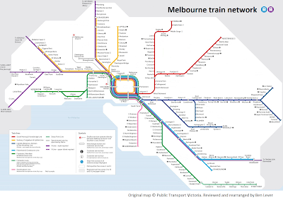
| A geographically-accurate map of Melbourne's railways (source) |
The new PTV map really throws the geography out the window to the extent that it becomes less useful. For example, the Mernda line goes pretty much directly north-south between Lalor and West Richmond, as does the Upfield line between Upfield and Jewell - and in fact they parallel each other quite close together for much of that distance. If you're heading into Melbourne's north, there's a good chance that your destination lies between these two lines - so, for example, if one line is down because of a track fault, you might be best to take the other one and catch an east-west bus across to your destination. Similarly, there is quite a big gap between the Hurstbridge and Lilydale lines, where the Yarra river runs (and where Doncaster is wholly reliant on buses), but you wouldn't know it to look at this map - it makes them look very close together.
After a while of grumbling about these issues, I decided to have a go at revamping the map to make it more geographical. Because I was trying to show how this map could've been done better - rather than showing a completely different concept of what the map could look like - I gave myself two rules. One, I had to stick with the style vernacular of the current map - the same lines, colours, styles, methods of placing station names, etc. Two, I had to stay within the same 2048x1448 pixel frame as the original, on the assumption that this reflects an actual physical frame on a station platform that needs to be accommodated once it's printed out - no cheating and stretching things out to fit some extravagant layout. (Also, I did it in MS Paint rather than using Adobe Illustrator or whatever...which isn't really a rule, it's just how I roll). Anyway, the result is below.
 |
| My revamp of the PTV network map. Click to embiggen. |
The first thing to note, of course, is that mine doesn't include the V/Line trains beyond suburban Zone 2 - so it's really just a map of Melbourne's network rather than Victoria's. I just couldn't find a way to fit them all in while remaining true to the basic layout and size of the original. Which arguably disqualifies it because it doesn't really meet the original design brief. I was originally quite pig-headedly thinking "Well, that just goes to show that it's not possible to fit all of them on the same map within a frame this size!" but a month or so after I finished, I came across their 2014 concept version which effectively did it - albeit rotated to portrait rather than landscape. So, yeah.
Anyway. The lack of V/Line trains aside, there's still some elements I'm not 100% happy with. The original version I made in 2017 terminated at South Morang and was just a straight line, but when they extended the line to Mernda I really wanted a way to emphasise that it does deviate a lot beyond Epping, so I added the little cowlick at the top...but it ended up just looking a bit fiddly. I may end up changing this to a completely-vertical line in future (unless of course the much-touted branch line between Lalor and Wollert ends up happening). Similarly, the Hurstbridge line is really very squiggly in real life and I wanted to give at least some sense of this, but every attempt I made just ended up looking ridiculous so I stuck with the 45-degree line.
Imperfect and unprofessional as it is, it does (I hope) show some of the problems with the official map, which the actual professionals who design these could do a much better job of fixing than I did. Hopefully as the map gets updated - for example when the Melbourne Metro 1 tunnel comes online - they can make some tweaks to make it a bit more geographically accurate. In the meantime, hopefully some of you find it handy for your personal use.
A big thanks to Philip Mallis for taking the time to update the geographically-accurate Wikipedia map for me. Philip does lots of great maps ranging from geographical to diagrammatic, which you can find on his website

I like it! And nothing at all wrong with using MS Paint - it's the end product that counts, not the software. My only small quibble is that the lack of a curve on the Ringwood Line makes the Belgrave branch labels a bit too squashed.
ReplyDeleteI like the map. It is kind of geographically correct, and as someone who caught The Tube from Charing Cross to Embankment when it would have been quicker to walk, I like geographically relevant maps, although The Tube map now does indicate it may be quicker to walk.
ReplyDelete